|
Chapter
12
Developing
a Workflow
When you begin working
with large
numbers of images, there are a number of things you can do to improve
your post-processing efficiency. One of those things is to
develop a workflow—i.e., a “recipe” for processing your photos,
including both a sensible ordering
for post-processing tasks, and a set of common parameters that work
well for your particular equipment. For example, you may find
that your images look best if you first sharpen them using a large
sharpening radius, then resize them to a resolution suitable for web
pages, and then apply another round of sharpening using a much smaller
sharpening radius. This ordering
of particular post-processing operations (i.e., sharpen, then resize, then sharpen again) constitutes a workflow—or, more likely, a tiny
part of a much larger workflow that takes you from each RAW image to
the final printed or “published” image. The set of typical parameter values that you
apply—say, a resize ratio
of either 33% or 50% and a sharpening
radius of either 0.15 or 0.3—form
an important component of that workflow, since they help to reduce the “search space” that you have to explore every
time you try to perfect
an image. Once you know which parameter values typically work
well for the images produced by your particular equipment, you’ll be
able to more quickly find the perfect parameters for each image, since
you have fewer options to consider. In this way, you can make the
task of processing thousands of bird photos much less tedious and
time-consuming. The purpose of this chapter is to help you to
develop a workflow that works well for you—for the types of bird
photos you typically take, and for the equipment you’re using to take
them.
12.1
An Example
Workflow
We’ll begin with an example: a
high-level overview of my own workflow. Just keep in mind that my
workflow works well for the types of bird photos that I take, and for
the particular equipment that I’m using, and may not be ideal for
you. In fact, when processing image sets from different photo
shoots, I’ll typically apply a slightly different workflow optimized
for the particular subjects and lighting environments encountered on
each shoot. The point here is to try to understand what a
workflow is, what it’s composed of, and how it can be flexibly applied
in practice to save you time. Subsequent sections in this chapter
will address and refine individual aspects of post-processing workflows
for bird photos.
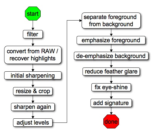
Fig. 12.1.1: A
hypothetical example of a workflow for digital
processing of bird images. Developing a workflow of your own
will help you to process large numbers of bird photos more efficiently.
Your workflow should be customized to the capabilities of your
equipment,
the types of birds you typically photograph, and your particular
artistic
goals. A workflow is a template only: steps can of course be
skipped
or repeated or re-ordered to suit individual photos that require
special treatment.
Recently I worked my way through ~6000 bird photos
(5779, to be exact) taken on a three-week trip through several states
in the eastern U.S. Because the vast majority of those photos
were of warblers, there were a number of commonalities that I was able
to exploit in crafting my workflow for this set—e.g., the fact that
the birds’ beaks were all small (so that emphasizing color and detail
in beaks wasn’t overly necessary), the fact that most shots do not
feature
wings spread (so that special processing of under-wing surfaces was
unneeded), and the fact that plumage colors tended to be bright and
variable (so
that highlight recovery and saturation warranted significant
attention). After processing the first 500 or 1000 images, I had
settled into a workflow that worked well for those types of
images. Following that workflow for the remaining images improved
my efficiency, saving me a considerable expenditure of time. Let’s now consider the elements of a
generic workflow like the one illustrated above.
The first thing I do when processing a large number
of
photos is filter them.
That is, I try to quickly identify those photos that are worth
processing, and to discard those that clearly aren’t. This is
probably the most crucial step, in terms of maximizing your
efficiency. If you can rapidly eliminate from consideration the
30% or 50% or 80% of photos that simply have no real potential—for
whatever purpose you’re pursuing—then you may save yourself a
significant amount of time by not even trying to post-process those
photos that simply have little or no potential to be turned into
masterpieces.
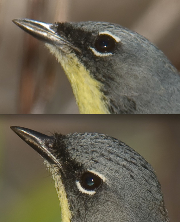
Fig. 12.1.2: Assessing critical sharpness. Top: a Kirtland’s
warbler
that did not show up sharp in the frame, due to motion blur or mis-
focusing. I skipped that photo. Bottom: the same bird, very
next photo.
This photo is critically sharp, so I continued processing it.
Note that
sharpening was applied (100% zoom in ACR), so what’s really being
assessed here is sharpenability.
The image above
illustates just one part of my filtering process: assessing critical sharpness.
Double-clicking the image file brings up Adobe Camera Raw (ACR).
I immediately zoom in to 100%, so that each screen pixel represents
exactly one image pixel (no interpolation).
At this point I make a judgment call as to whether the bird looks sharp
enough to warrant continued post-processing of that image. If the
bird appears tack-sharp, I continue; otherwise, I’m likely to skip that
photo and go on to the next. Note that when viewing photos at
100% in ACR you’ll be seeing the effects of any sharpening parameters
you’ve selected. Thus, what you’re really assessing is the sharpenability of the image—i.e., how well it sharpens up
under reasonable sharpening parameters. In the top part of the
figure above, the bird was not critically sharp, probably due to either
motion blur or mis-focusing. I skipped that photo and went on to
the next, which is shown in the bottom of the figure; that photo was
critically sharp, so I continued processing it.
Assessing critical sharpness is simply one step in
my filtering process. Additional filtering techniques,
particularly those geared toward filtering
large numbers of photos, are discussed in section 12.4
of this chapter.
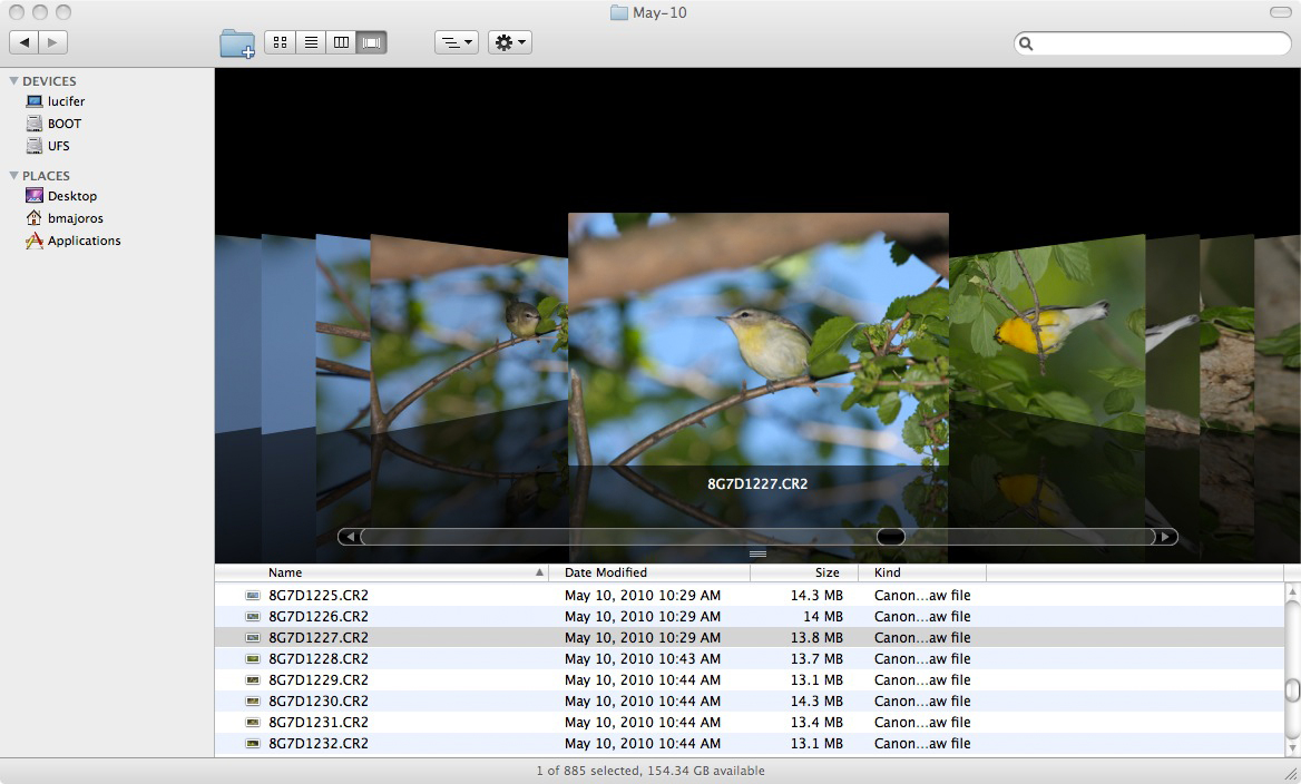
Fig. 12.1.3:
Filtering large numbers of photos efficiently requires
software support. Many people use the Photoshop Bridge application
as a method to rapidly preview images, but I prefer the Finder
application
in Apple’s Max OS X operating system (similar to the File Manager in
Windows),
because I can rapidly scroll through files with large previews. I
can rapidly delete
files that are obviously useless, and rank the remaining images either
by assigning
them a filename color, or by dragging them to different subdirectories.
Once I’ve
filtered a large set of photos down to a
more manageable set of the most highly promising images, I then convert
each RAW file and import it into Photoshop for further
processing. Though the RAW conversion process provides for a
myriad of options and parameters, in my workflow I ignore all but a few
of these. The most important to me is the detection and repair of
blown highlights, via the Recovery
slider in Adobe’s RAW converter (typically followed after RAW
conversion by the Highlights
tool in Photoshop proper). If the entire image is
significantly underexposed I’ll also brighten it with the Exposure slider or the Brightness slider. If the
overall exposure level is good, but some important
parts of the image are draped in shadow, I may use the Fill Light slider to lighten them
up a bit. I also perform sharpening and noise reduction in ACR
(see sections 11.1 and 11.6).
RAW conversion parameters are
addressed in more detail
in section 12.5 of this chapter.
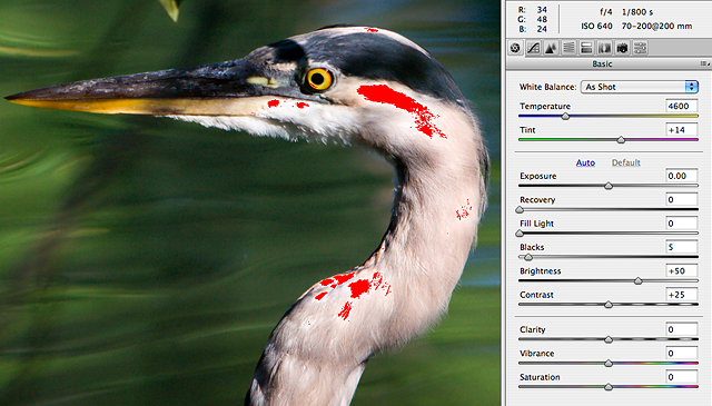
Fig. 12.1.4:
The first steps after filtering are to recover blown highlights, reduce
noise, and apply basic sharpening, all of which are best done in Adobe
Camera Raw.
Once my image has been converted from RAW and is in
Photoshop proper, if I haven’t applied any sharpening in ACR
then I generally apply an initial sharpening in Photoshop proper (via Unsharp
Mask) of 500% at a radius of either 0.3 or 0.4. This
initial
sharpening is intended to correct for the effects of the antialiasing
filter that most manufacturers place over the imaging
sensor.
This antialiasing filter reduces the incidence of unnatural moiré artifacts, but
unfortunately
also reduces the apparent sharpness of resulting images. Camera
manufacturers therefore recommend some initial sharpening in
post-process to correct for the blurring effect of the anti-aliasing
filter. The amount of sharpening and the radius may be highly
camera-dependent, however, based on the strength of the anti-aliasing
filter, so it’s important to experiment with your own images to
discover the best setting(s) for your camera. I usually perform
my initial sharpening pass in ACR, as discussed in section 11.6.
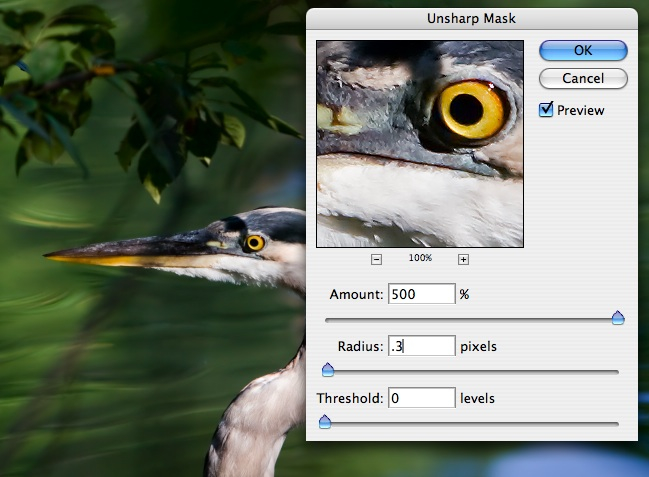
Fig. 12.1.5:
Though many authors advise against sharpening until the very last
step, I believe it’s necessary to apply a basic sharpening to the image
before
resizing, to keep the resizing algorithm from discarding too many
subtle details.
Pre-resizing sharpening can be done in Adobe Camera Raw or via the
Unsharp
Mask in Photoshop proper. For images to be displayed on a web
page, a
medium-
radius sharpening filter prior to resizing is often most effective.
For images that
I intend to deploy over the internet
(as opposed to images that I intend to print onto paper or canvas), I
then concern myself with finding the ideal image size and
resolution. For my particular camera, which has a 10 megapixel
sensor, I most often choose a resize
ratio of either 33% or 50%, though I occasionally choose 25% or
(very rarely) 66%. My objective at this stage is to find a zoom
level that results in the most acceptable compromise between apparent
sharpness and subject proportions. For example, zooming in
generally enlarges the subject in the frame while reducing the apparent
sharpness, and obviously reduces the amount of scenery visible around
the bird. I try to find a zoom level that makes the bird appear
big enough without sacrificing too much sharpness; if the background
scenery is particularly colorful or otherwise pleasant, I may take this
into account by exploring the tradeoff between subject size and
inclusion of scenery. Finding this ideal tradeoff doesn’t involve
any hard-and-fast rules: I simply view the image at different zoom
levels and choose the zoom level that seems most pleasing to my
eyes. And of course, what looks most pleasing to my eyes today
might not look best tomorrow (especially if lighting conditions in the
room where I’m doing my post-processing change).
Once I’ve found a zoom level that looks pleasing to
me, I then resize the image to that zoom level, so that the resulting
image is at 100% zoom (i.e., each image
pixel is represented by exactly
one screen pixel). Once
I’ve done this, all subsequent processing
will affect the image exactly as it would be seen when viewed via an
internet browser (notwithstanding system gamma differences—see section 16.2.4—and any rescaling
that the browser might, somewhat regrettably,
impose). Note that the RAW image remains intact after this (and
any other) step, so that I’m free to generate other sizes of the same
image by simply going back to the RAW image and resizing differently.
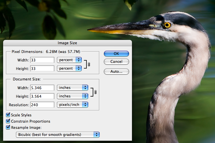
Fig. 12.1.6:
For images to be displayed on a web page, you’ll need to reduce
the resolution of the image via the Image Size tool. For my 10
megapixel
camera, I typically reduce my images (prior to posting them on the
internet)
to 25%, 33%, or 50% of their original resolution, and usually also crop
them.
Immediately
after resizing I typically apply a
second round of sharpening, since the resizing operation (default Bicubic in Photoshop) generally
results in a loss of apparent sharpness. However, whereas I
generally use a sharpening radius
of 0.3 or 0.4 for the first round of (full-resolution) sharpening (when
done in Photoshop proper rather than ACR),
after resizing I generally use a radius of 0.2 or 0.15 for the second
round of sharpening, and I experiment with the Amount slider to find a setting
that looks good to my eyes for each particular photo. Note that
some authors suggest delaying the sharpening step till later, and
indeed I do sometimes delay this second sharpening until after I’ve
adjusted the exposure and contrast (see below).
With the image resized to its final resolution, I
then consider my options for framing
the shot—i.e., where to place the bird in the frame. Since I
generally resize to no less than 33% of the original resolution from my
10 megapixel RAW files, I’m generally left with an image that still
needs to be cropped a bit to fit comfortably within a web
browser. The question then is how to crop the image—both in
terms of how big to make the cropping rectangle, and also where to
position the rectangle around the bird. In the figure below, I’m
cropping a rectangle around the bird that places the bird on the left
side of the image, facing right. Decisions regarding how to crop
an image are related to composition,
which was discussed in section 8.1.
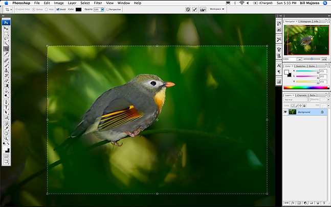
Fig. 12.1.7:
Using the Crop Tool to reduce image size. Once you’ve reduced the
resolution
via the Image Size tool, so that the subject appears at the appropriate
size (i.e., so that its
details are still visible and it appears naturally sharp), you’ll often
want to crop the image
to produce a more artistic framing of the subject. In the RAW
image, your subject will
often be in the center of the photo, but with careful cropping you can
often move the
subject to a more aesthetic position in the final scene, as per the
rule-of-thirds, etc.
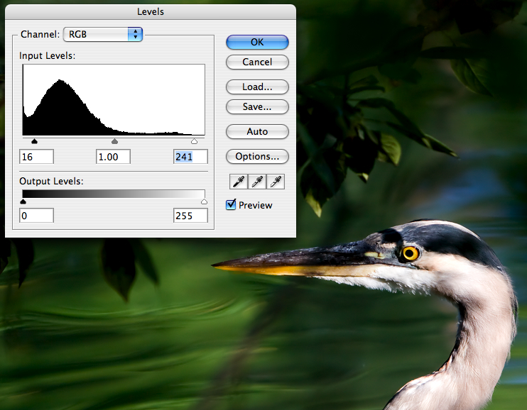
Once the composition has been set via cropping, I’ll
typically attend to gross exposure issues next. If both the
subject and its background are overexposed or underexposed, I’ll
correct both simultaneously with an initial exposure adjustment, via
one of several tools. In the figure below I’m adjusting the
overall exposure via the Levels
tool, but sometimes I also use the Shadows/Highlights
tool, the Curves tool, or the
gamma slider in
the Exposure tool. Most
of the time I rely on a combination of Levels and Shadows/Highlights.
Fig. 12.1.8:
Overall adjustments to exposure can be performed before or after
adjusting the image size and cropping. A round of highlight
reduction is often
useful before adjusting image size/resolution, though another round of
exposure
adjustment may well be warranted after sizing and cropping.
The foregoing
exposure adjustment is applied to the
entire image, so it’s not intended to correct problems that only affect
the bird, or that only affect the background. In order to address
these types of issues, it’s necessary to first separate the bird from
the background. In Photoshop there are a number of different ways
to do this (several of which we’ll discuss in this and later chapters),
but for now I’ll just describe the way that I most often do it—and I
use this technique for about 99% of the bird photos I process.
The first task is to select the bird.
(Alternatively, you could select the background, if that’s
easier.) For this task I use the Quick Selection Tool (see the
figure below). With this tool, all you have to do is click on the
bird and drag the mouse cursor around to all regions interior to the
bird’s outline; the tool is very smart, and can often figure out
exactly where the bird’s outline lies, without having to be precisely
told. It’s not perfect, however. In the example below, you
can see that the branch separates the main part of the bird from its
tail; when I tried to use the tool to select the whole bird, the tool
wanted to include part of the branch, until I specifically told it not
to do so. Methods for using this tool are described in detail in
section 10.6.
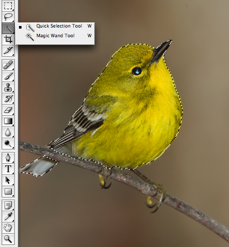
Fig. 12.1.9:
Separating the subject from the background can be
performed using one of the various selection tools in Photoshop.
My favorite is the Quick Selection Tool. In many cases, I can
select
the subject in a matter of a few seconds. Depending on the
resolution
of the image and intended application, more or less precision may be
called for when selecting the subject’s contour.
In the above figure you’ll also
note that I haven’t selected the bird’s
legs. Depending on what you’re trying to accomplish it may or may
not be necessary to precisely select all of the bird’s
extremities. For this example my goal was to produce a
low-resolution image for display on a web page, and I decided that for
this purpose it would be fine to just treat the bird’s legs as
background.
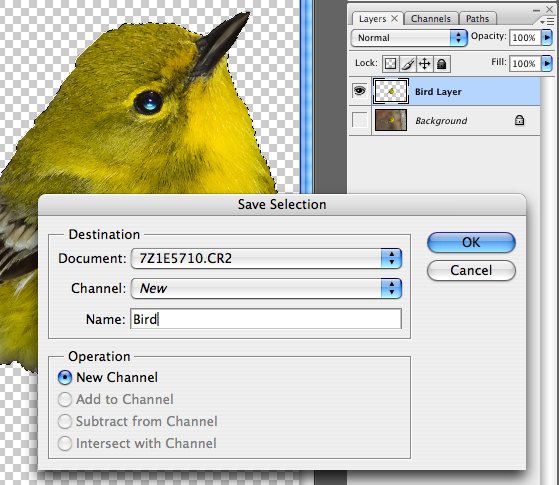
Once I’ve got the bird selected, I then save the
selection in case I need to recall the selection boundary later; in
Photoshop you can save multiple selections, and even give them names
like “bird” or “background”. I also copy the bird into
its own layer, which can then
be processed
separately from the background layer. In the figure below, you
can see that there are two layers listed in the pane on the right, a “Bird Layer” and a “Background” layer.
Fig. 12.1.10:
Always save your selections before creating new layers with them.
You may find uses for your saved selections later, such as via unions
and
intersections between selections, etc. Saved selections are
stored in the
Photoshop “PSD” file, so
they’ll be available during subsequent postprocesing
sessions on the same image. The same is true of layers.
With the bird and the background
effectively separated into different
layers, I’m then free to apply effects to the bird which will emphasize
its presence in the image, or to de-emphasize the background (thereby
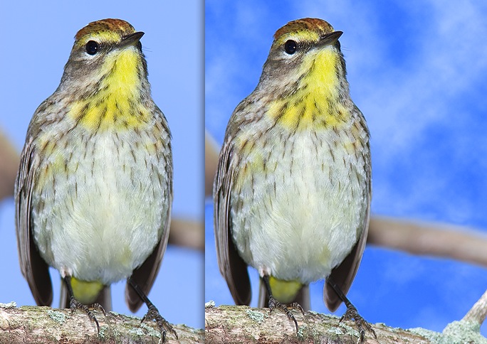
indirectly emphasizing the bird). When the background consists of
a uniform sky, I’ll also sometimes add clouds via the Filter >
Render > Clouds effect in Photoshop, as illustrated
below. (Chapter 13 delves into various advanced techniques such
as replacing the background or rendering artificial clouds in the
background layer).
Fig. 12.1.11:
Differential process of the bird and its background is an enormously
powerful technique. In this example we’ve added an artificial
cloud layer to the
image, behind the bird. Since the clouds are contained on their
own layer, they
can be turned off and on with a simple click of the mouse.
Differential treatment of the
subject and its background, or more
generally of individual regions of the image separately from the whole,
is probably the most powerful technique available for producing
visually striking bird photos.
Moving along to the later stages of our sample
workflow, we’ll now consider the issue of eye-shine. When flash has
been used to illuminate the bird,
there will often be unpleasant artifacts visible in the bird’s
eye. These can be fixed in a variety of ways, but I most often
use a small brush tool to paint some black pixels over the offending
region of the eye. In the figure below, you can see that I’ve
blackened out the bluish glare in the lower half of the eye, while
leaving the catchlight.
Without the catchlight, the bird’s eye
would appear dead, so when there isn’t a natural catchlight in the
image I’ll then paint one in, using a 1-pixel brush set to a white or
gray color; techniques for fixing eye-shine were discussed in detail in
section 11.4.
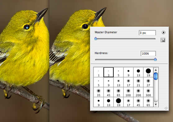
Fig. 12.1.12:
Fixing eye-shine is an essential step for many bird photos taken
with flash, though with practice you’ll find that it needn’t take more
than about
thirty seconds to fix. In this case we’ve used a 3-pixel black
brush with maximal
hardness to paint away the eye shine from the bird’s retina, while
leaving untouched
the natural catchlight from the bird’s cornea, which helps to convey
something about
the three-dimensional shape of the bird’s eyeball.
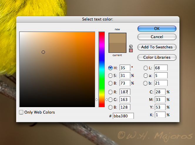
Finally, I make a habit of always
signing my photos. This is a
good idea if you’re concerned about people using your images for
commercial purposes without your permission. I also include a
copyright symbol (©) to make explicit that I wish to retain legal
rights to my images. To avoid making my signature too intrusive
to the overall image aesthetics, I generally choose a text color that
roughly matches the background color, as illustrated below. For
the font,
I choose “Handwriting-Dakota” in Photoshop.
Fig. 12.1.13:
It’s important to sign your work in a way that doesn’t compromise
the overall aesthetic impact of the image. I like to use a font
that mimics handwriting,
and to use a color that is close to the background color close to the
text. That way,
many people won’t even notice the signature unless they specifically
look for it.
Remember that the idea is to subtly mark your work without being
obtrusive.
In the sections that follow, we’ll
consider each of the foregoing steps in detail, and survey some of the
many alternative ways of achieving these and similar effects. We
note in passing that much of the efficiency of using a custom workflow
derives from being familiar with the keyboard shortcuts (key
combinations) that invoke the various tools that you use.
Photoshop allows you to set your own key combinations, so if the
predefined shortcuts are awkward for you to type, you can change them
to something less awkward, or easier to remember. I highly
recommend using this feature. Also note that some steps in your
workflow may be automatable via special software such as Adobe’s
popular Lightroom program.
|
|
|