|
PART III :
POSTPROCESSING
|
Whereas Part I of this book offered advice
on choosing photographic equipment and Part II provided guidance on the
effective use of that equipment in the field, Part III deals with the processing
of the resulting images on your computer. We will consider not
only the use of special “effects” to improve the visual appeal of
your
images, but also methods for organizing and maintaining the large
corpus of image files that as an active digital photographer you’ll
eventually accumulate. While there are many books and tutorials
available on the topic of image processing in Photoshop, our treatment in this
part of the book will be quite specifically tailored to addressing the
problems that most commonly arise when processing digital photos of birds.
|
Chapter
10
Fundamentals
of Image Processing
Before diving in to a
detailed discussion of the techniques for digital processing of bird
photos, there are a number of important concepts about computer
graphics that need to be understood. Advanced readers will no
doubt have a firm grasp on most of these concepts already, but for
bird enthusiasts only recently introduced to computers, this chapter
should fill in the relevant gaps about the basic underlying
technology of digital image representation. In order to
articulate these concepts in as simple and concrete a manner as
possible, we’ll assume the editing software to be used is the industry
standard, namely Adobe Photoshop;
for readers using alternative products, the underlying concepts will
remain the same, though the details of the software interface may
differ superficially.
10.1
Zooming, Cropping, and Resolution
Perhaps the first question needing
to be addressed is why digital photos need to be “processed” at
all. In the days before digital photography, the film from your
35mm camera obviously needed to be “processed” (chemically) in order to
produce a photographic print. Now that cameras record their
images directly to digital media, you might very reasonably expect that
those images should be ready for immediate display on a computer
(perhaps after being transmitted over the internet via a web page, or
via email) or
for sending to a digital printer.
Of course, one of the advantages of digital
photography is that any blemishes or defects you perceive in the photo
as captured by the camera can be corrected via software, and this is
one good reason for learning about techniques for digital image
processing. But there’s a more fundamental reason—namely, the
issue of target media.
In
order for an image to be optimally rendered
(i.e., displayed) on a
medium such as
a computer’s LCD screen or a sheet of
photographic paper, the image file needs to
be transformed into a format appropriate for that medium. This
transformation may involve mapping between color spaces (see section 14.1),
mapping
between computer platforms such as PC and Macintosh (via gamma correction—section 16.2), or
simply adjusting the resolution
of the image so as to be rendered at a
desired size (i.e., on
photographic
paper of particular dimensions, or within a web page with a given
formatting). In this section we’ll deal with issues stemming from
the latter consideration: resolution.
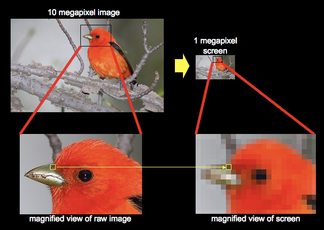
Fig. 10.1.1:
The relationship between the image in memory and what is rendered on
the computer screen. Top: a 10 megapixel image (left), when
rendered on a 1 megapixel
screen (right) obviously results in a loss of some information, since
each screen pixel
represents multiple image pixels. Bottom: a magnified view of the
raw image (left) shows
that the bird’s head retains considerable detail in the underlying
photograph, while a
magnified view of the corresponding portion of the computer screen
(right) shows
that those details can’t be rendered on the screen because the screen
doesn’t have
enough pixels. To see these image details on screen, you’d have
to zoom in
and look at just a portion of the image.
A useful mental exercise is to
consider how a 10 or 15 megapixel image from a digital camera can be
displayed on a roughly 1 megapixel screen—i.e., a typical 1440×900-pixel computer monitor or
laptop LCD (1440×900 = 1296000, or roughly 1
megapixel). Obviously, since not all of the pixels in the
image can be displayed on the screen at once (since the screen
has fewer pixels than the image), you’ll have to either view just a
part of the image,
or somehow reduce the image resolution (number of pixels in the
photograph) in order to fit the entire image
on screen. Today’s image-editing software makes this issue
largely transparent by allowing you to “zoom” in and out of the
image—i.e., to view the image at different resolutions, or zoom levels, so that different “amounts” of the image will fit on screen
at one time. This may
at first seem a rather mundane issue, but there are some important
subtleties that arise, particularly when digital manipulations (such as
those described in the next chapter) are applied to the image and their
aesthetic effect is appraised, by eye, at
different zoom levels.
Let’s first consider how the pixels comprising a
digital
image are mapped, by
Photoshop or similar software, to pixels on your
computer
screen. The cartoon below illustrates the basic concept.
Fig. 10.1.2:
Interpolation of image pixels for rendering on a computer
screen. If the raw image has more pixels than the screen, then
displaying
the entire image on the screen all at once requires that each screen
pixel
represent multiple image pixels. The color of each screen pixel
is an
interpolated value, or average, of the image pixels that it represents.
This is very important to keep in mind, as we’ll see later.
If the raw image has more pixels
than your screen, then each pixel on
your screen has to represent multiple pixels when the full image is
rendered on the screen. In the cartoon above, a block of 24
pixels, ranging in color from yellow to red, are highlighted at
left. Given the relative dimensions of the image and the screen
in this hypothetical example, these 24 pixels in the image need to be
mapped to a single
pixel on the screen, in order for you to see the entire image all at
once. When the various yellow, orange, and red hues (precise color values) are
averaged together numerically, they result in an orange hue, which is
then used by the computer as the color of the single screen pixel
representing these 24 pixels from the raw image.
Now, if you were to apply a color adjustment in
Photoshop, this orange pixel that you see on the screen would likely
change to some other hue—perhaps to a somewhat lighter or darker hue
of orange. That’s what you’d see on your screen. But
because you’re not viewing the image at 100% zoom—that is, because each
pixel on the screen represents more than one pixel in the image—you
won’t see precisely how the image
pixels are affected by the color adjustment you’ve just made. All
you’ll see is the average
effect. For the purpose of making color adjustments to an image,
that’s typically not a problem.
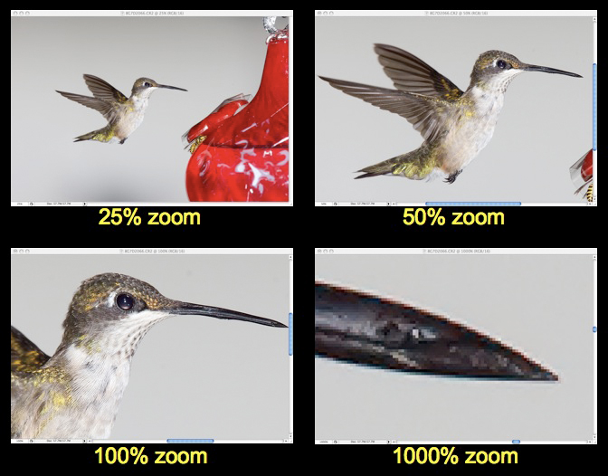
Fig. 10.1.3:
Zooming. In order to fit the entire image on screen, you’ll
generally have to zoom
out to some zoom level less than 100%. For my particular computer
screen and my particular
camera’s resolution, a 25% zoom level works best for me, but your
hardware may be different.
Just keep in mind that sharpness and contrast (and some other image
qualities) are best evaluated
at 100% zoom (possibly after re-scaling and cropping the image).
For detailed editing of
individual pixels, as with a digital paintbrush, a zoom level higher
than 100% is often required.
This issue
becomes especially critical when applying
image filters that affect the apparent sharpness of the image.
Because birds have so much fine detail in their feathers, sharpness is
often one of the most critical issues when assessing overall image
quality of a bird photo; this applies both to how other viewers assess
your artwork and
to how you decide which of your photos to publish, or which to keep and
which to delete. When postprocessing your images, you should
always assess sharpness at 100% zoom (when each screen pixel represents
one
image pixel). If you’re viewing an image at less than 100% zoom,
you just need to keep firmly in mind that the apparent sharpness and
contrast in
the image, as you’re currently viewing it, may change dramatically when
you resize the image to its final dimensions. When you’re ready
to begin tweaking the sharpness of the image, make sure you’re viewing
the image at 100% zoom. This is especially applicable for images
that you intend to publish on the internet. For images that you
intend to print to photographic paper or canvas, I instead recommend an
empirical approach
involving iterative rendering to the target media
until optimal settings are found—see section 14.1.
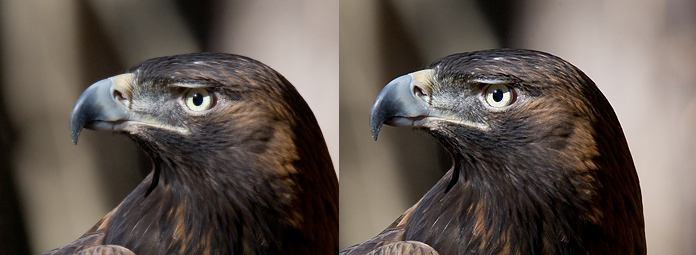 Fig. 10.1.4:
Sharpening by the same amount at different zoom levels has a
profoundly different effect. Left: sharpening at a radius of 0.15
has very little
visible effect when viewing the image at 25% zoom. Right: after
resizing
to 25% resolution and viewing at 100% zoom, sharpening at 0.15 radius
has an easily discernible effect.
Largely
separate from the issue of zoom level is the issue of cropping. These two concepts
are often confused, since zooming an image on screen can result in
apparent cropping of the visible portion of the image in the viewing
window. The difference between zooming and cropping is simple:
whereas zooming temporarily changes the apparent magnification and
framing of an image on your screen, cropping permanently discards the
margins of the image outside the crop region. Zooming is
something you’ll typically do liberally during postprocessing when
switching between a full-image view to a pixel-for-pixel view of the
image (and back again). Cropping, on the other hand, is typically
done just once
to an image, to effect an artistic framing of the subject.
Cropping results in the actual deletion of pixels from the image,
while zooming merely changes how the image’s pixels are displayed on
your screen (and how many image pixels per screen pixel).
Cropping is an important tool for artistic
expression, since the manner in which an image is cropped—i.e., the
precise dimensions of the cropped rectangle, and how those relate
spatially to the original image boundaries—can profoundly affect the
viewer’s perception of the subject and how that subject relates to its
surroundings. In section 8.1 we discussed
composition principles
for bird photos, which involved choosing the relative placement of the
subject within the scene. Implicit in that discussion was that
the relative positioning of the subject relative to the scene was to be
effected by movement of the lens prior to taking the photo—i.e., “framing the shot”. In the field, composition
effects are seen
through the viewfinder of the camera, but during postprocessing you can
often effectively modify the composition (i.e., the “framing of the
shot”) via creative cropping of the
image.
Fig. 10.1.5:
When the subject is relatively small in the frame, cropping is often
useful.
Precisely how you crop your images, both in terms of the re-scaling
ratio and the
composition resulting from how you place the subject within the crop
rectangle,
can profoundly affect the aesthetics of the final image. I always
explore a range
of re-sizing ratios and crop compositions in order to find the
combination that
“feels” best to
me. Finding the best crop is sometimes the most time-consuming
part of my post-processing workflow.
Since cropping
permanently discards pixels from the
outer margin of the image, it’s highly advisable to keep an original,
unmodified version of the image in your archives in case you ever want
to re-crop the image differently. A prime example is if you first
crop the image for posting on your web site, and then later decide to
make a photographic print of the image. When making prints, there
are a number of circumstances in which you’ll want to include a larger
margin around the subject than you would when posting snapshots on the
internet. One such example is when making canvas wraps (section 14.2); in the
latter case you may need to include an additional 1 to 3
inches of margin for the sides of the wrap.
Intertwined with the twin issues of zooming and
cropping is the issue of resolution.
A number of definitions of resolution are in common use, and
unfortunately, several different definitions are useful. The main
dichotomy, for our purposes, is between optical resolution and image
resolution. Optical resolution deals with the smallest
details in
the actual scene that can be resolved—i.e.,
visually separated, or discriminated, by
the viewer—through an optical system. For example, if you can
confidently say that you can see the individual barbules in a bird’s
feather, then
you’re attesting to a higher degree of resolving power, or resolution,
than if you can merely distinguish individual feathers from each
other. Optical
resolution is useful to consider when choosing between different
lenses. When postprocessing images that you’ve already taken with
your lens, this definition is less useful.
For existing images, resolution typically refers to the
image dimensions, in units of horizontal and vertical pixel
counts. For the leftmost eagle image in the above figure, the
resolution of the source image was 972×648 pixels (width × height), whereas for the image on
the right the
resolution of the cropped source image was 566×377. In this figure these two
source images were
rendered at the same print size
of (approximately) 340×230 pixels. This reduction
in resolution was achieved in Photoshop via interpolation (i.e., averaging
of adjacent pixel hues), with more aggressive interpolation required
for the larger source image in order to reduce it to the same target
size as the smaller image. Because rescaling image pixels in this
way typically reduces apparent sharpness, artificial sharpening in
software is often performed after rescaling (see section 12.1).
The practical importance of resolution differs
somewhat for digital and print media. For posting images onto web
pages (i.e., on the
internet), a reasonable range of sizes for rendering on today’s
computer screens is from 400×400 to 900×600. The largest photos I post
on my own web site are 1400×900, but these are so large that
many viewers can’t see the whole image on their screen at once (keep in
mind that the web browser program takes up some of the screen space
with its menu, scroll bars, and navigation panes). Different
users on the internet have computers with different screen sizes,
though most should be able to view a 600×900 image without difficultly
(possibly after enlarging, or “maximizing”, their web browser window).
As LCD screen technology continues to advance, users’ screens will
likely feature increasingly large numbers of pixels per inch, on
average, so these numbers may change over time.
Fig. 10.1.6:
Examining apparent detail at a given print size. For this 30×20-inch canvas
print,
I was glad to see that fine details were still apparent, even though
the image was only 3600×2400
pixels. The ideal image resolution for a print task can depend
both on the print medium and on
the individual characteristics of the particular photo. A very
sharp photo of lower resolution
may print better than a less-sharp photo of higher resolution.
Unfortunately, the only sure
way to know if your image is of high enough resolution is to print it
on the target medium and
assess the quality of the final product by eye.
For print media—i.e., actual
photographic paper or canvas prints—much higher resolutions are usually
desired in practice. For example, my most popular canvas wrap
measures approximately 30×20 inches, with a 1-inch border,
and was made from a 3600×2400-pixel image (a mere 8.6
megapixels), though most of the 20×16 inch (plus margins) canvas
wraps I’ve made were from 4800×3600 pixel images (~17
megaixels). For 8×10 prints on standard photographic
paper, I like to have an image resolution of least 2200×1800 pixels (~4 megapixels),
though smaller images can sometimes still result in moderately decent
prints. The minimum image resolution for a given print size
depends very much on the image itself, and can also depend on both the
specific paper type and the printer used to make the print. The
only way to know for sure whether your image is of high enough
resolution to render at a given print size is to actually make the
print and assess the quality by eye. More information on making
prints is given in section 14.1.
Adjusting image size in Photoshop is simple.
The Image Size dialog box
lets you resize based on a desired pixel
count (e.g., 900×600), a desired scaling ratio (e.g., 50% of current
size), or a desired print size
(e.g., 8×10 inches). For photos to be
posted on a web page, simply bring up the Image Size dialog box, change “pixels” to “percent” in the drop-down menu, type the
desired percent in the “Width” field (the Height field will be
updated automatically to retain a constant aspect ratio—that is, ratio of width to
height), and press the OK button. I always use the “Resample Image” option with “Bicubic” as the resampling algorithm (the “Bicubic Sharper” doesn’t produce very good
results, in my opinion—instead, I manually sharpen the image once
before resizing, then resize it, and then sharpen again, using the Unsharp Mask, as described in
section 12.1).
Fig. 10.1.7:
Re-scaling an image in Photoshop. The Image Size dialog box
allows you to scale an image by pixel counts, by document size (inches,
centimeters), or by scaling ratio (percent of current size). For
web
distribution of images, I typically rescale to either 33% or 50%.
Now let’s
briefly consider
image navigation in
Photoshop. The figure below shows the various panes and palettes
as they appear in the default layout of Photoshop. Along the
bottom you can see the current zoom
level, which for this figure was set to 25% so that the entire
image would fit on my computer screen. At left is the main tools palette, from which you can
select an individual tool to use in processing your image. There
are tools for cropping the image, adding text (such as a signature),
painting (as with a digital paint brush), and selecting regions of the
image (such as a bird’s head) that you’d like to process differently
from the rest of the image; we’ll discuss all of these tools in detail
later. At the top of the screen, just below the main menu, is
another pane that allows you to set the parameters of the current tool
that you’re using—for example, the size of the brush that you’re
painting with. At right are the navigation
and layers panes. The layers pane shows you the layers
making up the image. In the figure below there is only one layer,
but often you’ll want to isolate the bird by placing it on its own
layer; this makes it very easy to apply effects to just the bird, or to
just the background, thereby helping to make the bird stand out
visually from its surroundings.
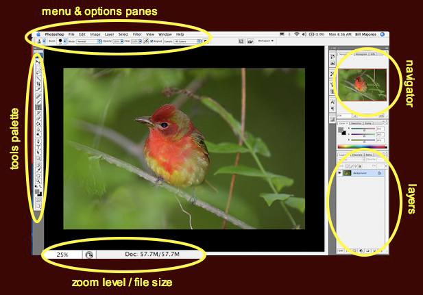
Fig. 10.1.8:
Tools, menus, layers, and navigation panes in Photoshop.
The tools palette contains many useful tools that determine what happens
when you click or drag with your mouse cursor on the image. The
layers
panel shows image layers that you’ve created via the selection
tools. The
navigation pane is useful for panning around to different parts of the
image
when viewing at large zoom levels.
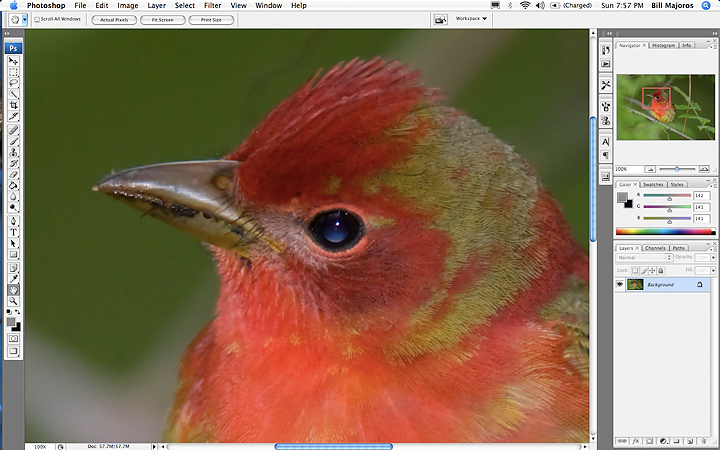
Fig. 10.1.9:
Navigation in photoshop. Panning to different parts of the image
can
be achieved in multiple ways. The navigator (upper right) shows
you the full image
and allows you to pan by dragging the red box over the image. The
scroll bars allow
vertical or horizontal panning. The hand tool allows you to drag
the image around
within the main image window. Finally, keyboard commands such as “Page Up”
and
“Page Down” can be used to
navigate to different parts of an image.
An alternative to using the
navigator is to drag the scroll bars
(the thin blue segments shown along the bottom and rightmost margin of
the main image window). Yet another way to pan around in image
space is to select the hand tool
(from the tools palette at left) and to simply grab the image by
pressing and holding the mouse cursor, and drag the image around within
the main image window. I find all three methods (the navigator
pane, the scroll bars, and the hand tool) to be useful, at different
times; once you get used to using all three methods you’ll find that
you can navigate around the image very efficiently.
Finally, let’s briefly survey the most useful tools
available in the tools bar. The figure below shows the tools that
I use on a regular basis; those that I rarely or never use are grayed
out. You’ll notice that four of the tools are dedicated to
selecting regions; as we’ll see in section 10.6,
Photoshop provides a
rich set of methods for selecting regions of the image that require
special processing, and this will come in very handy for making the
bird stand out from its background. After the selection tools,
the next most powerful and useful tool is the clone tool, which can be used
either to remove unwanted elements from the scene (such as unsightly
branches) or to repair blemishes, such as missing feathers (for birds
in molt). We’ll learn how to use this amazing tool in section
11.5.
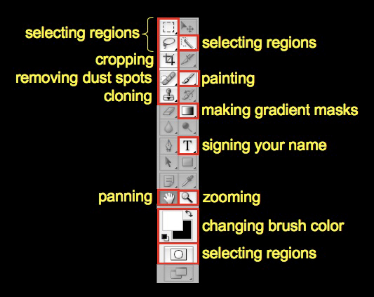
Fig. 10.1.10:
The toolbar in Photoshop. The most useful tools for processing
bird
photos have been outlined in red. Most prominent are the
selection tools,
which allow you to separate the bird from its background and then apply
different processing to each. The clone tool is another extremely
powerful
utility that you should work hard to master. All of the tools
have keyboard
shortcuts, which can drastically improve your efficiency.
The tool with the band-aid icon
(the healing brush) is mostly
useful for removing tiny spots due to dust on the camera’s imaging
sensor. Next to this is the brush
tool, which paints pixels a solid color; this is mostly useful
for fixing flash artifacts in
the eye, and for adding a catchlight
(see section 11.7). The gradient
tool (with the white-fading-to-black icon) is mostly useful for
blending layers in a gradual manner, and will be discussed in chapter
13. The part of the tools palette dedicated to changing brush
colors is worth understanding, since it is useful both for fixing eye-shine and for adjusting
selection boundaries in quick mask
mode (section 10.6). The white square
represents the foreground color
(white by default)
and the black square corresponds to the background color (black by
default). Clicking on either of these will bring up a dialog box
that allows you to select the new foreground or background color, while
clicking on the tiny, curved arrow swaps the foreground and background
colors. The foreground color is the color that is used when you
paint over parts of the image using the brush tool; the background
color comes into play less often, though it can be used to quickly
switch to an alternate painting color by clicking the “swap colors” arrow (or pressing the X key on
your keyboard).
The zooming
(magnifying glass icon) and panning
(hand icon) tools have already been discussed, though it’s worth noting
that zooming can be achieved much more quickly by pressing the
appropriate key combination—on Mac systems, the Cmd-+ and Cmd-_
combinations zoom in and out, respectively. Some versions of
Photoshop allow you to explicitly set keyboard shortcuts for all the
tools, as well as for any of the special filters and other actions
available via the menu, and I highly recommend taking full advantage of
this feature, since it can drastically improve your efficiency when
performing complex series of operations on an image.
|
|
|
