|
10.3
Image Layers
As will be explored in much
greater detail later in this book, an extremely powerful method of
improving the visual impact of bird photos is to process the bird
separately from its background, to make the subject stand out more
prominently. More generally, it’s often highly desirable to
process different parts of the image differently—for example, to darken
one part of an image while lightening another, or to sharpen the
subject while blurring the background, etc. In many cases (though
certainly not all), this is best accomplished via the use of image layers.
Layers in photoshop are a lot like layers in a layer
cake. If you imagine a layer cake in which the layers are
different shapes and colors, and if you imagine looking down on the
cake from above, you can envision that the top layer will eclipse a
certain portion of the layers beneath it, but that some parts of those
lower layers may be visible nonetheless, if they “poke out” around the edges of the top layer
(and any other layers above them).
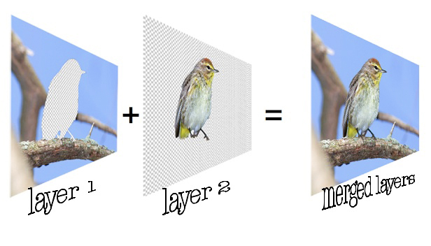
The figure below illustrates this more concretely in
the case of bird photography.

Fig. 10.3.1:
Layers in Photoshop. Separating elements of the image
into different layers is convenient because it affords much greater
efficiency when applying effects intended for only one part of the
image. Merging the layers then produces a complete image.
In this case, we’ve partitioned the original image into two layers:
layer 2 contains all of the pixels making up the bird, while layer 1
contains everything else. If you were to merge these two layers
together, you’d get back the original image. The reason it’s
useful to separate image elements into separate layers is that it makes
it very convenient for when you want to apply any sort of digital
manipulation (e.g., adjusting the sharpness, exposure, saturation,
contrast, etc.) to just the bird, or just the background, or to some
other important element in the photo which naturally stands by itself
or perhaps simply requires the most extensive processing.
Making layers is easy in Photoshop. Once
you’ve got some important part of the image selected (selection is discussed section
10.6), you can make a new layer
containing just that part of the image
by pressing Cmd-J on a Macintosh computer (Ctrl-J on a Windows
PC). A new layer will be created and can be selected by clicking
on it in the layers panel
(typically located near the lower-right part of the screen). The
figure below shows a typical layers panel. In this example we’ve
created four layers: a text layer (for signing the photo), a cloud
layer (for adding some artifical clouds in the background), a
background layer, and the full image which includes the subject (named
here “Background” because that’s the default name
assigned by Photoshop to the original layer comprising the entire
image).
Fig. 10.3.2:
The Layers panel in Photoshop. Layers can be
renamed, moved higher or lower in the stack, toggled off
and on, given layer masks that make parts of a layer
transparent, blended with other layers in various ways,
and made semi-transparent to any integral degree.
The layers panel has a number of powerful
features. First, notice the eyeball icons to the left of each of
the four layers in the figure above. Clicking on any of these
will cause that layer to toggle between the visible and invisible
states. This is especially useful for special-effect layers,
because you can repeatedly toggle the layer on and off until you decide
whether the image looks better with or without that effect. In
the upper right corner of the layers panel you’ll see that there’s an opacity setting, which can be set
differently for each layer. When the opacity is less than 100%,
the layer becomes semi-transparent; this is useful for special-effect
layers that might look overly gaudy or artificial at 100% opacity, in
which case a lower opacity might produce a more tasteful degree of
subtlety. The blending mode
(upper left corner of the panel) is a powerful tool that I almost never
use, but that can come in handy in rare cases.
The “add a mask” button along the bottom of the
panel creates what we call a layer
mask, which shows up as an additional icon in the layer
bar. This is a very powerful tool which takes some experience to
master but can save considerable time once you’re comfortable using
it. The mask is a pattern that determines which parts of the
layer are visible, and which are (fully) transparent. You can
select the mask and paint on it using the brush tool (section 10.1).
Any region of the mask that you paint in black causes the corresponding
part of the layer to become transparent. The nice thing about
masks is that if you make a mistake, you can easily fix it by switching
your brush color between black and white and re-painting that part of
the mask. You can also use shades of gray to indicate partial
transparency. Masks facilitate one form of nondestructive editing, in which
edits that you made previously can be easily changed later by simply
re-painting parts of the mask. They’re especially useful for
blending only part of a layer with other visible layers, by painting
the mask in various shades of gray (such as via the gradient tool—section 10.1).
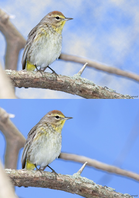
The figure below shows just one of the many useful
things you can do with layers. In this case, we’ve created a
special layer with artificial clouds rendered by Photoshop’s built-in
cloud effect. The top image shows the result of enabling the
cloud layer, while the bottom image shows the result of disabling the
cloud layer. By repeatedly toggling the layer on and off, the
pros and cons of utilizing the layer in the final image can be assessed
visually without having to rely too much on imagination.

Fig. 10.3.3:
Assessing a special effect via layer toggling. Top: an
image in which an artificial cloud layer is toggled on. Bottom:
the
same image with the cloud layer toggled off. The ability to toggle
layers like this on and off significantly eases the task of assessing
the aesthetic value of various processing options.
Note that images that contain layers should ideally
be saved in Photoshop’s proprietary PSD format, to retain the maximal
amount of information. In order to export the image to JPEG
you’ll need to flatten the
image (either permanently or temporarily), which simply means that you
need to merge the layers into a single composite image. I
recommend keeping both the original RAW file from the camera and the
PSD file containing any layers you’ve created, in additional to any
flattened JPEG’s you’ve extracted from the PSD file. The JPEG’s
are useful for posting images on the internet or for making paper or
canvas prints. The PSD’s are useful if you need to touch-up some
part of the image (e.g., if after printing the image you find that the
bird doesn’t stand out from the background enough), or if you need to
extract additional JPEG’s at different resolutions. The RAW files
should, in my opinion, never be deleted, since you never know when you
might find some flaw in a processed image that can only be fixed by
going back to the RAW image and re-processing it from scratch.
One disadvantage of the use of layers is that each
additional layer requires more memory (and hard drive space) to store,
and can slow down your computer if you use too many of them. This
problem can be partially alleviated by installing more RAM (memory)
into your computer, though disk space remains an issue.
As we’ll see in section 10.6,
a simpler, quicker,
and somewhat less powerful alternative to layers is the use of saved selections. The ideal
balance between the use of these various techniques (i.e., layers
versus saved or de novo
selections) is one which each photographer needs to find based on his
or her own postprocessing style and hardware.
|
